Semitra Exhibition tFont/fTime in YCAM
2009-09-08
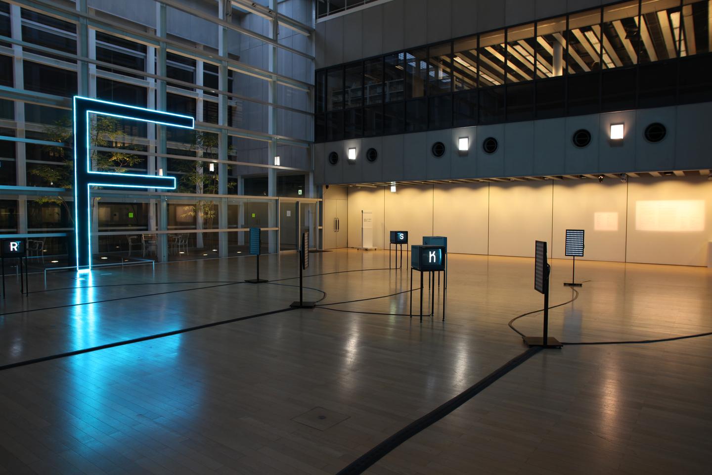
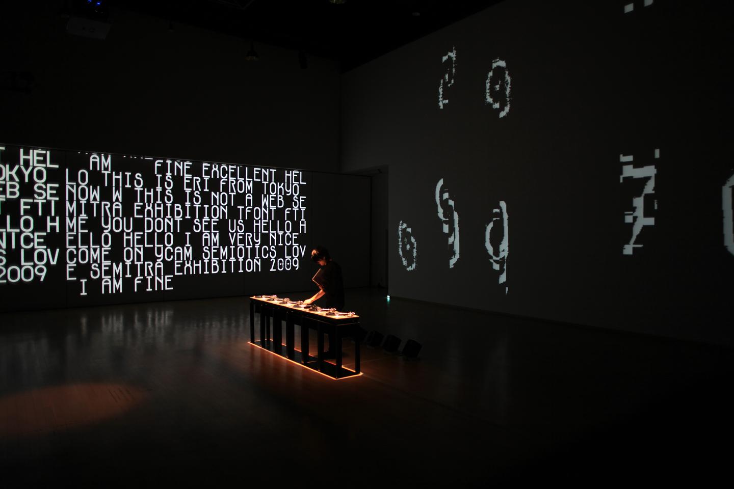
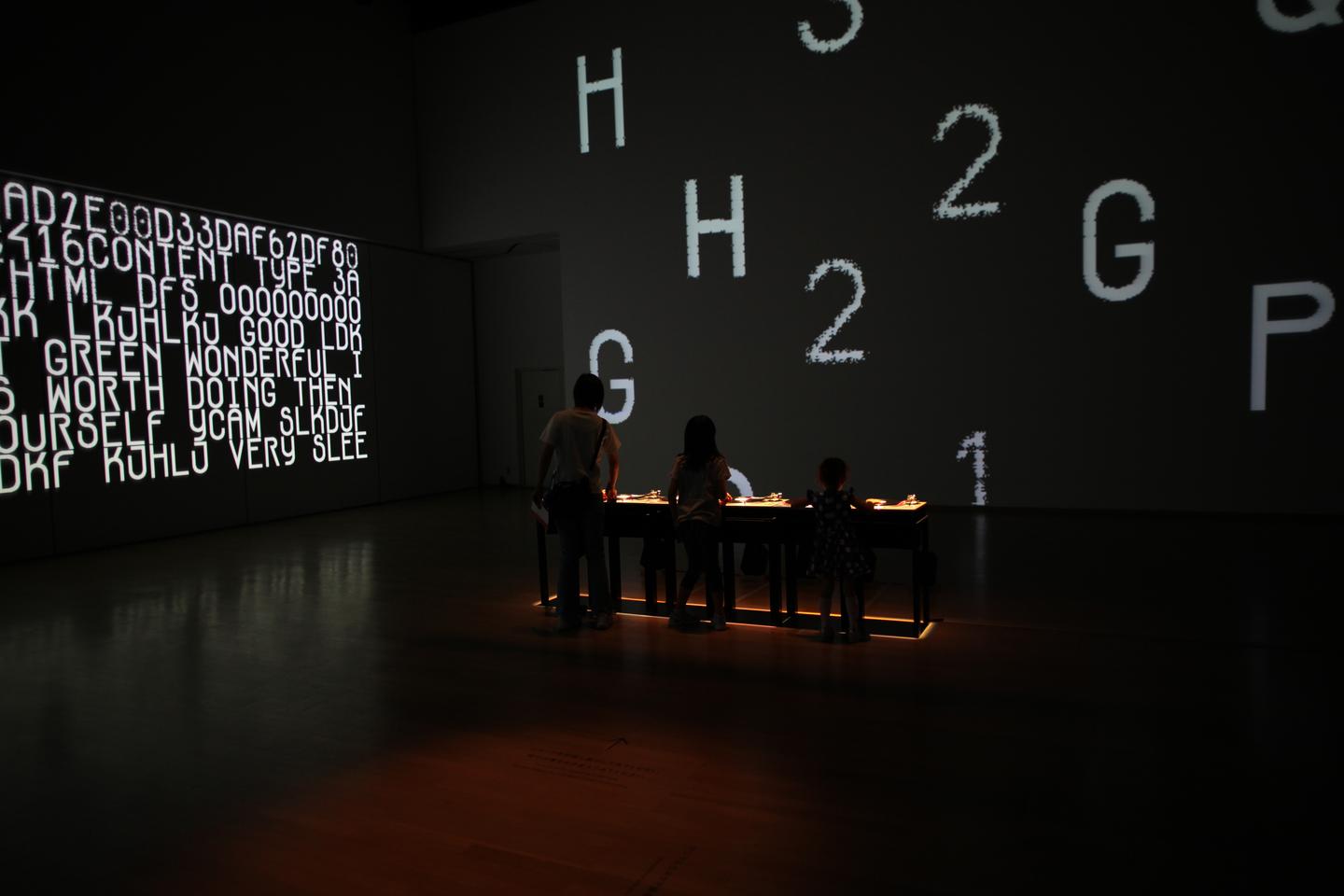
タイトルの「tFont/fTime」とは、「時間フォント/フォント時間」をあらわし、フォントが時間によって変化していくプロセスを視覚化する新しい発想から、文字デザインを探求するこころみです。 本展では、近年急速に進展しているオリジナルフォントのデジタルデザインにとどまらず、フォントの変化・変形を、身体をつかって自由に触れたり、作ったりするストリートやスケートカルチャーのクリエイティブセンスを複合的に導入しています。 インタラクティブな要素を取り入れたインスタレーションは、観客が参加しながら体験できるほか、ウェブサイトを通じてアクセスすることもできます。
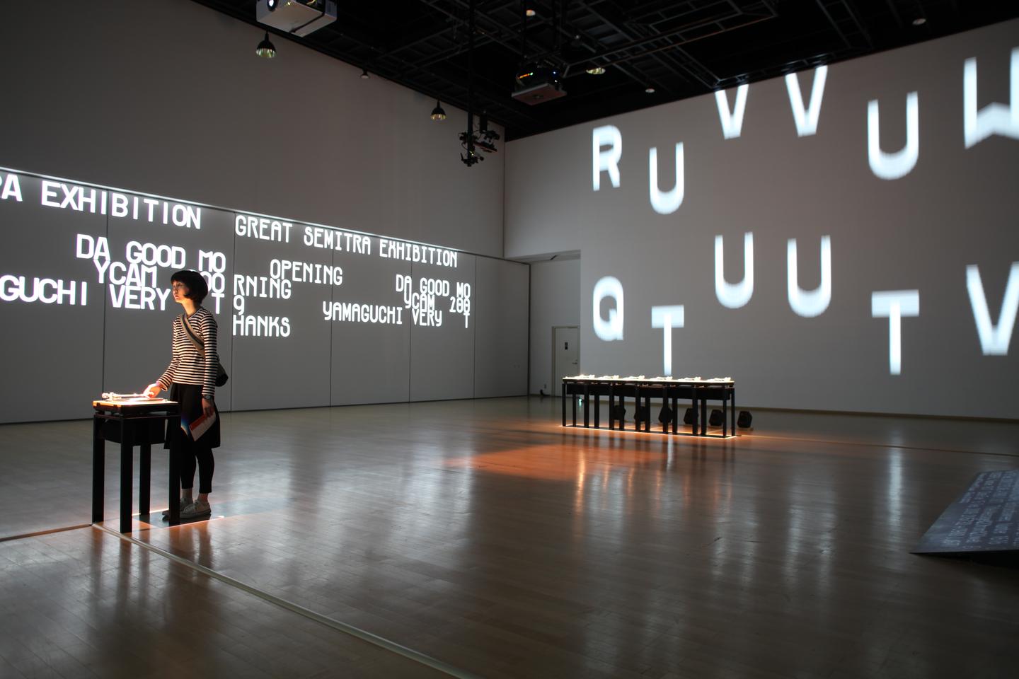
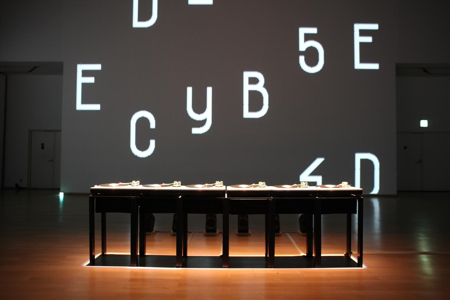
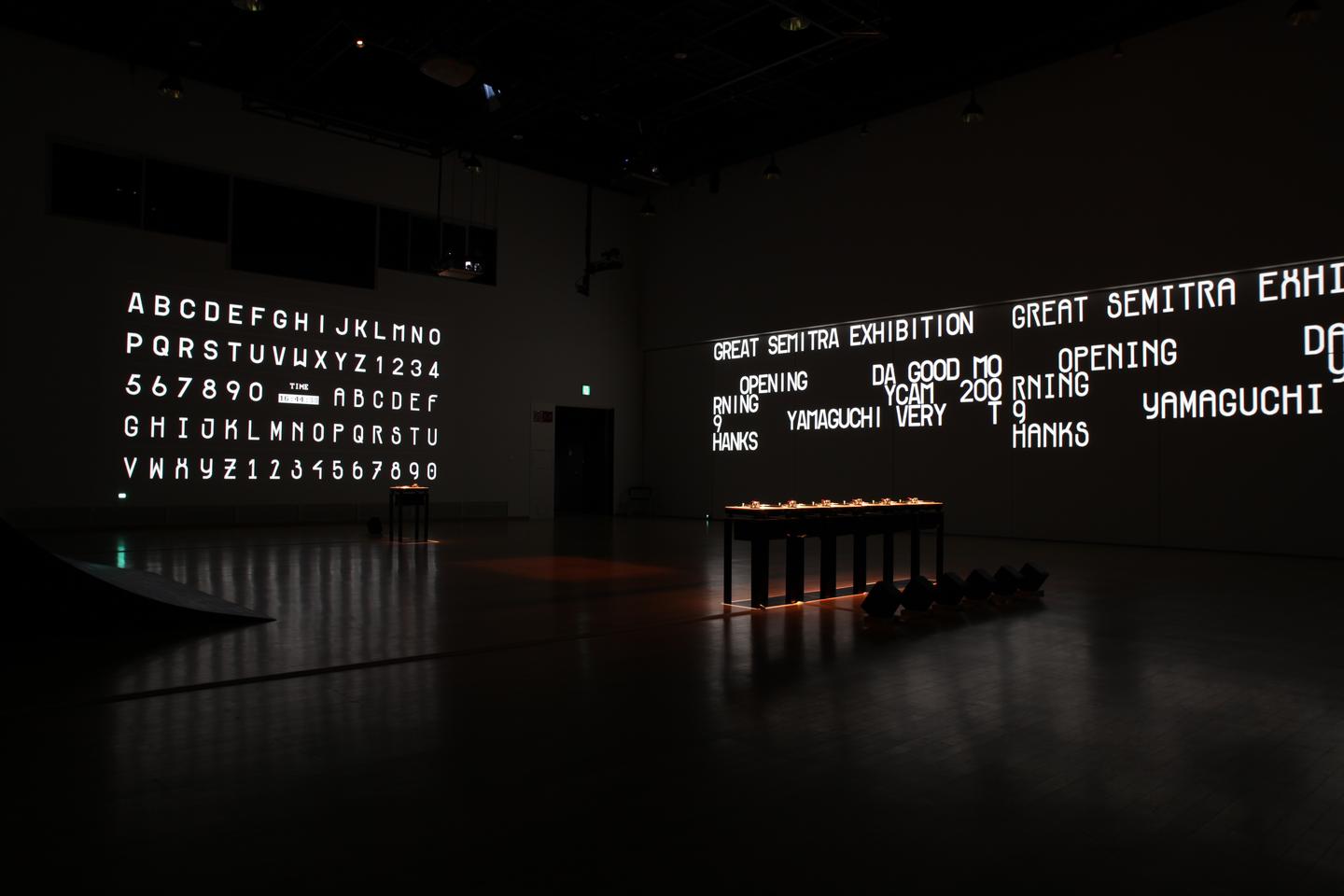
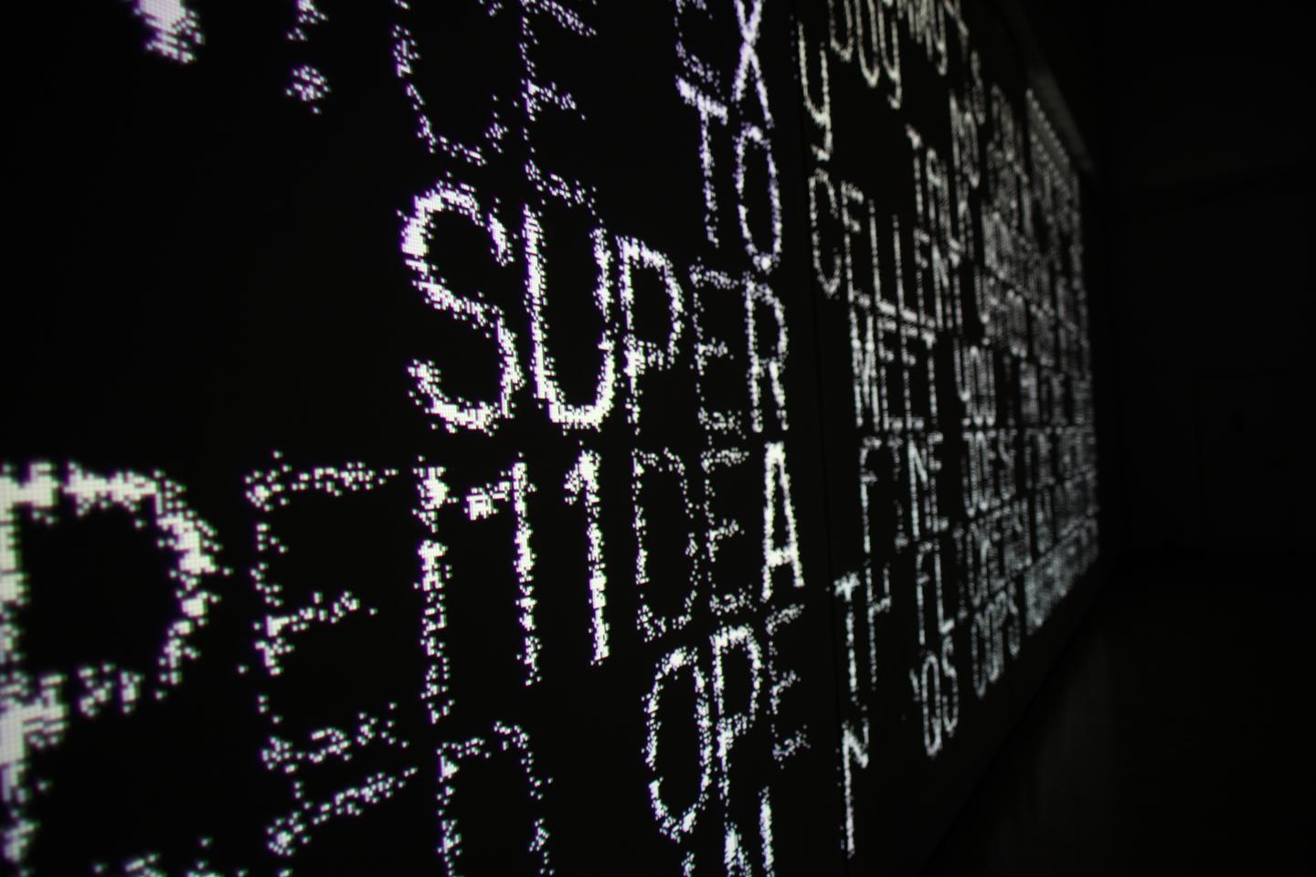
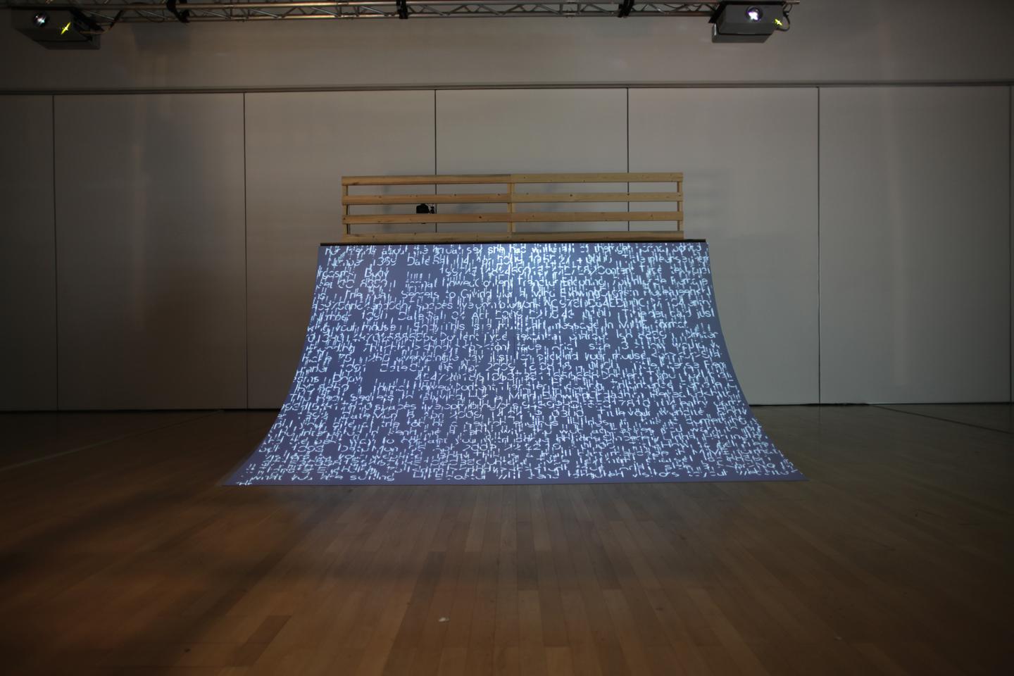
「tFont」は 2 次元であるフォントに時間軸を加えたものです。 一見でたらめな光の点滅に見える映像は、文字の軌跡を描画しており、シャッタースピードを落としたカメラなどで撮影することによって初めて読むことができます。このフォントのオリジナルは動的で読めない光の点滅であり、可読を獲得するためには写真を撮るなどの加工が加えられることになります。つまり「tFont」は他者によって加工/変形されることが前提に設計されたフォントです。そして、この加工/変形によって伝播していくウェブ的な文化に、ウェブクリエイティブの可能性を感じています。 今回 YCAM で展示する作品は、この「tFont」を使ったインスタレーションと、新作「fTime」をつかったインスタレーションを予定しています。「fTime」とは時間軸上にフォントを並べたもので、音楽を再生するようにフォントを再生するという試みです。 (田中良治/セミトラ)
Time produced by a typefaceExhibition of an installation + website born out of a new design ideaThe title “tFont/fTime” refers to the artistic process of gradually modifying a typeface (font) enhanced with a notion of time, and, reversely, mapping time with a font.This exhibition aims to explore and visualize novel typeface design ideas involving gradual transformation through an installation and graphic displays.In addition to experiencing the rapidly developing techniques of digital design that have produced a number of original typefaces in recent years, visitors to this exhibition will be able to control the transformation of a typeface directly at the venue or via the Internet.Look forward to an event charged with the creative sense of street and skating culture, manifested in works that a variety of people help created and-recreate by modifying typeface design and graphics.
“tFont” is a two-dimensional typeface with an added element of time. Dots oflight arranged in seemingly random patterns describe in fact the shapes of letters that can only be read when photographed with long exposure. This typeface consists of dynamic and in their original state unreadable blinking lights,so it requires the additional step of photographing or filming in order to become readable. In other words, “tFont” is a typeface that was designed based on the premise of being shaped/modified by a third party. The web specific transmission of culture through shaping/modification that happens here hints at the various possibilities of creativity on the Internet.The exhibition at YCAM this time is made up of an installation made out of the “tFont”, and another one incorporating the newly developed “fTime”. In the latter, the designers place a typeface on a time axis, and “play” the letters just as if they were playing music.(Ryoji Tanaka / Semitra)